

6 Packaging Trends You Can Use to Inspire Your Brand
Get inspired by 6 product packaging trends and learn how to choose a style that fits your brand, connects with customers, and stands out.
Updated March 2026 by Rachel Gerharter
Packaging trends and styles for your next design
Deciding on packaging and labeling for your product is a big step. Your packaging design—along with elements like your brand colors, materials, and logo—helps communicate your brand personality and makes your products recognizable to customers.
Whether you’re launching a new product or refreshing your current look, the right packaging style can make your brand feel more polished, memorable, and intentional. If you’re still developing your brand identity, it may help to start with the basics, like learning how to design a logo for your business.
To help inspire your next design, we’ve rounded up six packaging trends that are catching consumers’ attention right now. These product packaging ideas can also help you think about what different packaging styles say about your brand—and which one best fits the look and personality you want to create.
How to choose a packaging style
Your packaging style should reflect your brand personality and appeal to the customers you want to attract. Before choosing a design direction, think about what you want your packaging to communicate.
Ask yourself a few key questions:
- What personality do you want your brand to convey?
Clean and minimal, bold and playful, vintage and nostalgic, or luxurious and refined packaging styles all send different signals to customers. For example, minimalist packaging often feels modern and sophisticated, while vintage-inspired designs can highlight craftsmanship or heritage. - Who is your target audience?
Colors, graphics, and materials can make your packaging feel modern, natural, premium, or playful depending on who you’re trying to reach. For instance, bright colors and bold graphics may appeal to younger audiences, while neutral palettes and elegant finishes often attract luxury buyers. - What kind of product are you selling?
Different product categories often benefit from different packaging styles and materials. Handmade goods may pair well with rustic or eco-friendly packaging, while beauty and specialty food products often use sleek labels, metallic accents, or bold designs to stand out. - What materials and finishes fit your product?
Label materials and finishes can dramatically change the overall look of your packaging. Options like kraft paper can create a natural, handmade feel, while clear labels offer a sleek, modern look, and metallic accents can add a premium touch.
The packaging trends below highlight different packaging styles and the brand personalities they communicate.
1. Sustainability

Consumers are becoming more eco-conscious and are increasingly willing to pay a little more to shop responsibly. As a result, sustainable packaging has become an important style for brands that want to communicate eco-friendly values. Customers are often looking for reusable materials or low-impact, eco-friendly packaging.
Sustainable product packaging is simple, rustic, or organic design elements. It allows brands to add a touch of character and charisma to their packaging and labels. Sustainable packaging is a great fit for brands that want to highlight eco-conscious values, natural ingredients, or handmade craftsmanship.
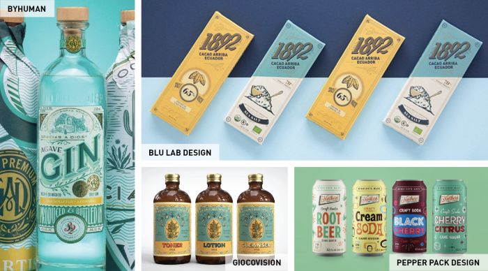
2. Bold colors
Continuing a tried-and-true trend, bright colors can create eye-catching packaging that stands out on shelves or online. Bold colors and playful patterns work especially well for brands that want to convey energy, creativity, or a fun personality.
This look can be achieved with vibrant color blocking, playful patterns, or illustrated graphics. Some brands use a single bold color to create a strong visual identity, while others combine multiple hues for a more vibrant design.
Colors can also influence how customers perceive your brand. For example, bright yellows and oranges may feel energetic and playful, while deeper blues or purples can suggest trust, sophistication, or luxury. Choosing a color palette that reflects your brand personality can help create packaging that resonates with your target audience.
3. A touch of nostalgia
Vintage-inspired packaging has remained popular for years and continues to resonate with customers. Focus on creating an authentic vintage feel—not only with your product labels, but also with containers like bottles, boxes, or tins that reinforce the overall aesthetic.
While mid-century modern design has been widely used, some brands are looking even further back for inspiration to create a truly distinctive look. Vintage-inspired packaging can help communicate authenticity, heritage, and craftsmanship, making it especially popular with food, beverage, and handmade product brands that want a classic or artisanal look.
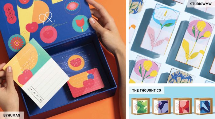
4. Illustrated and graphic designs
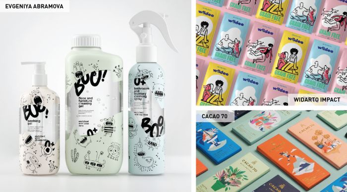
Designs that incorporate illustrations or bold graphics are becoming increasingly popular. Custom illustrations and graphic elements can help packaging stand out while giving your product a distinctive look.
Illustrated packaging also allows brands to tell a visual story and express a more creative or playful brand personality, whether through whimsical characters, playful patterns, or artistic designs. When used consistently across labels, containers, and other packaging elements, these graphics can add personality to your brand and help your products become more memorable.
5. Metallic accents
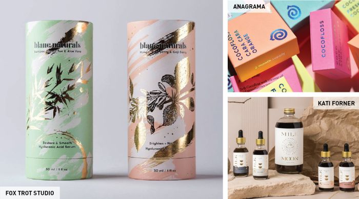
Metallic finishes can instantly give packaging a more luxurious or premium look. Whether you choose foil packaging, metallic labels, or small accents of spot varnish, these details can add visual impact to your design.
Spot varnish is a popular option for highlighting specific elements—such as logos, patterns, or product names—by adding subtle shine and texture. This technique allows you to create a premium look without the higher cost of full metallic or foil packaging.
6. Sleek black packaging
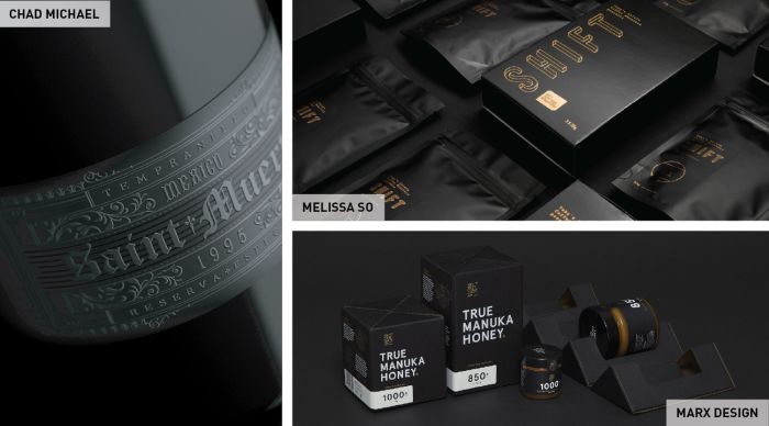
You can never go wrong with classic black packaging. Its timeless look works well for brands that want to create a sleek, sophisticated, or premium aesthetic.
With modern printing techniques becoming more accessible, there are more ways to enhance black packaging with subtle textures and details. Techniques like embossing, spot varnish, or white ink can create contrast and highlight important design elements without losing the bold impact of a dark palette.
Black packaging is also highly versatile, complementing styles ranging from minimalist and modern to vintage and ornate designs.
Choose a packaging style that fits your brand
The right packaging style can help communicate your brand personality and make your products more memorable to customers. Whether you choose bold colors, vintage-inspired designs, or sleek black packaging, the key is selecting a look that reflects your brand and resonates with your audience.
As you explore these packaging trends, think about which styles best align with your product, your target customers, and the message you want your packaging to convey.
Once you’ve chosen a packaging style that reflects your brand, custom labels and packaging materials make it easy to bring your design to life. Explore Avery printable labels and product packaging solutions to create a cohesive look across your products.

