Makeover Takeover: Shine Essentials
Tracy Roberts, owner of Shine Essentials organic body care, began creating homemade health and wellness products as an alternative to commercial goods. Today, Tracy operates a full line of all-natural, artisanal products intended to make customers feel loved, calm, whole and connected.
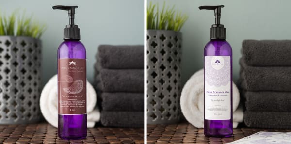
We loved the earthy, handcrafted look of Tracy's massage oil label, but it didn't communicate the quality of the ingredients. Our goal was to create a high-quality label - both polished and professional - without sacrificing any of Shine Essentials' down-to-earth charm.
Colors that convey sophistication
The rectangular label's maroon background didn't stand out against the purple bottle. To create contrast and lighten the look, we replaced the maroon with a crisp white, selecting two shades of lavender and gray for the text and imagery.
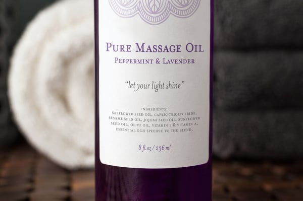
A glossy white finish adds a premium touch while protecting the label from oils. And, should Tracy switch to clear bottles, the design would remain visible against a clear film finish for a seamless, printed-on look.
A smartly organized label is pretty and potent
To prioritize the brand name without enlarging it, we shifted it upward - a common design tactic among brands. Because Shine Essentials is a homegrown brand, we removed the word "by", which is used by larger, less-personalized brands to denote smaller sub-brand extensions.
For added clarity, we magnified and centered the tag "Pure Massage Oil," with the scent - peppermint and lavender - just below. Otherwise, Shine Essentials' "Let Your Light Shine" catchphrase might have been mistaken for the scent.
Imagery that blends and pops
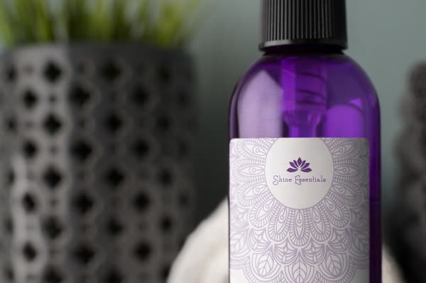
Paisley prints are common throughout the Shine Essentials brand, so we worked to integrate the graphics more cohesively. Because the two free-floating paisleys divided the overall design, we opted for one larger element that extends into the frame and forms a circle around the brand name, creating a calming ripple effect. This helped Tracy's label appear less fragmented - a nod to the brand's focus on wholeness.
A lasting label
Shine Essentials' new label is simple and calming. At the same time, lighter and brighter colors, along with ample white space, help the newly designed glossy white label pop in photos and on shelves.
Thanks to a revised color palette, integrated imagery and clear organization, Tracy's massage oil label is more elegant and effective without being expensive - a winning formula for a small brand seeking to deliver a strong impression.
My favorite aspect [of] the design was the pattern," says Tracy. Since her favorite color is purple, she was pleasantly surprised to find that we had incorporated the color into the label, too. I also love the logo with the image around it - I feel like it ties perfectly into the line," say Tracy, who already has plans to modify and streamline her labels. "I believe [this label] will help my brand grow, and help me stay focused and consistent."
Learn more about Shine Essentials at shineessentials.com. To get started crafting your own label, visit avery.com/smallbiz