Category: Special Occasions

How to Make Tickets for an Event or Raffle
November 8, 2023
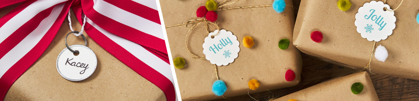
15 Fun Ways to Wrap a Gift with Personality
October 20, 2023
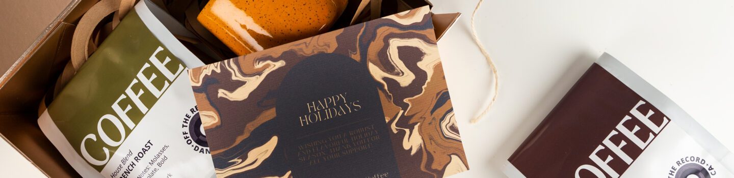
Inexpensive Gifts for Clients
September 18, 2023
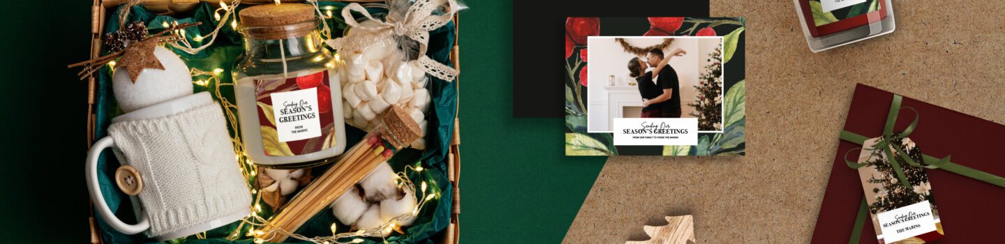
Easy Ways to Make a Gift Basket Stand Out
September 12, 2023

How to Create Save-the-Date Cards
June 28, 2023

How to Make Custom Candy Bar Wrappers
June 19, 2023

19 DIY Party Ideas for Your Best Celebration Yet
April 24, 2023
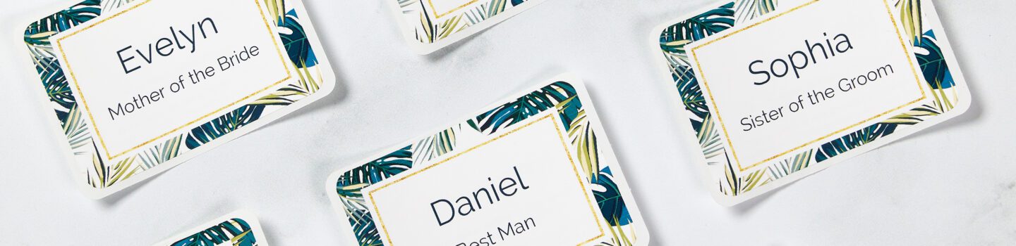
Tips for Planning a DIY Bridal Shower
April 12, 2023